by Crystal Glanz-Kreutz
Once a month our firm holds a “Topics and Snacks” event. These are one-hour in-house presentations of topics covering social, environmental, and technical subjects as they relate to architecture. Recently, Alisa introduced Stalled! to our group, who describe themselves as follows:
“Stalled! takes as its point of departure national debates surrounding transgender access to public restrooms to address an urgent social justice issue: the need to create safe, sustainable and inclusive public restrooms for everyone regardless of age, gender, race, religion and disability. Stalled! addresses this issue through lectures and workshops, writings and interviews, design guidelines and prototypes.”
After watching the video, we discussed our initial reactions and thoughts about this approach, including reflecting on recent projects that we have had where bathrooms were modified or redesigned. A bulk of our questions and discussion was centered around urinals; do you have them, do you forgo them, and if you have some toilet and some urinal stalls how do you go about identifying which is which? We shared our thoughts on safety, privacy, equitable access, and of course, plumbing walls. We all agreed that design should be inclusive, accessible, and responsive to all users and saw this approach by Stalled! as a wonderful resource for designers and architects to suggest inclusive solutions and push this conversation forward and to encourage our clients to create great spaces for all users.
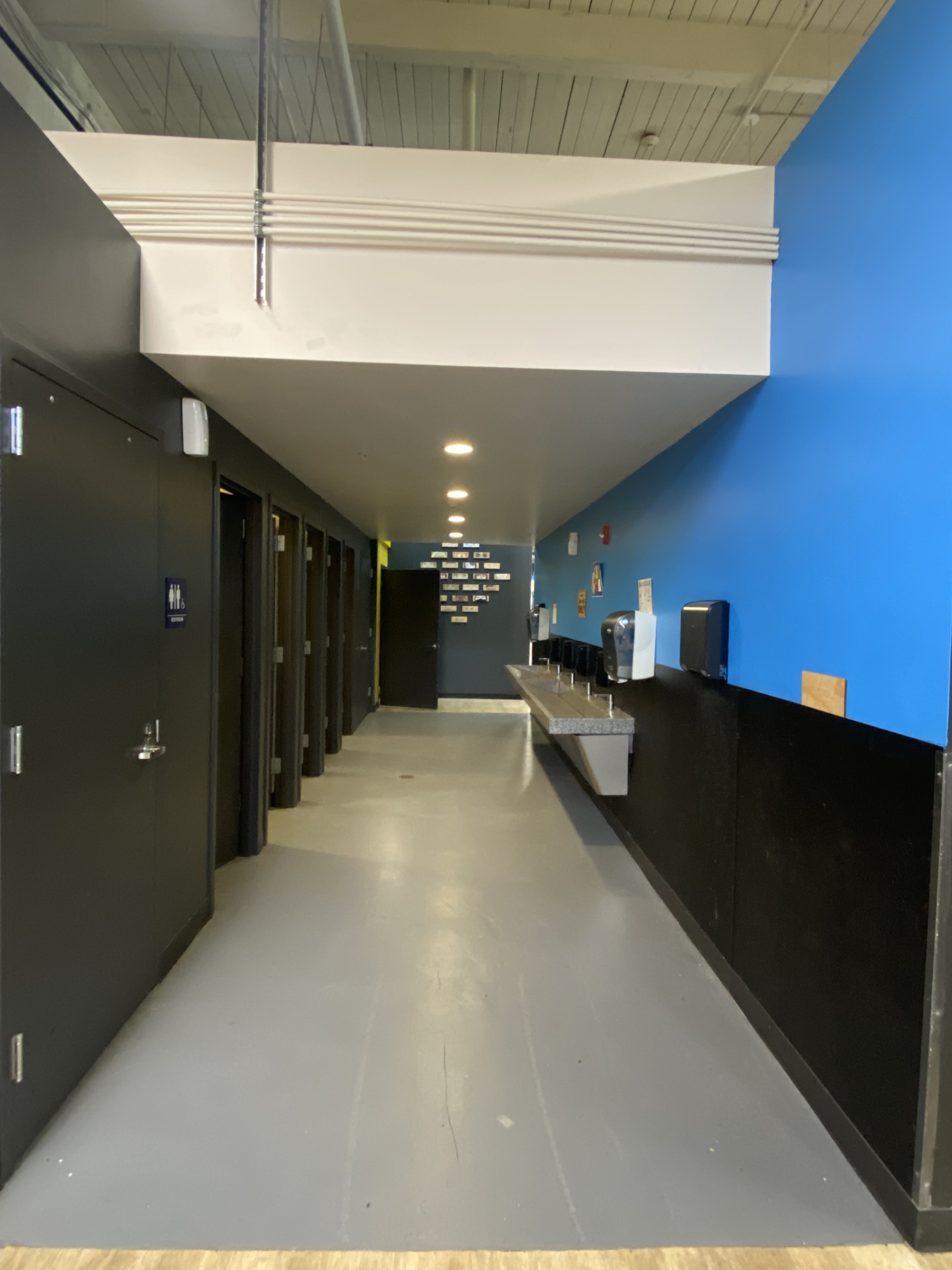
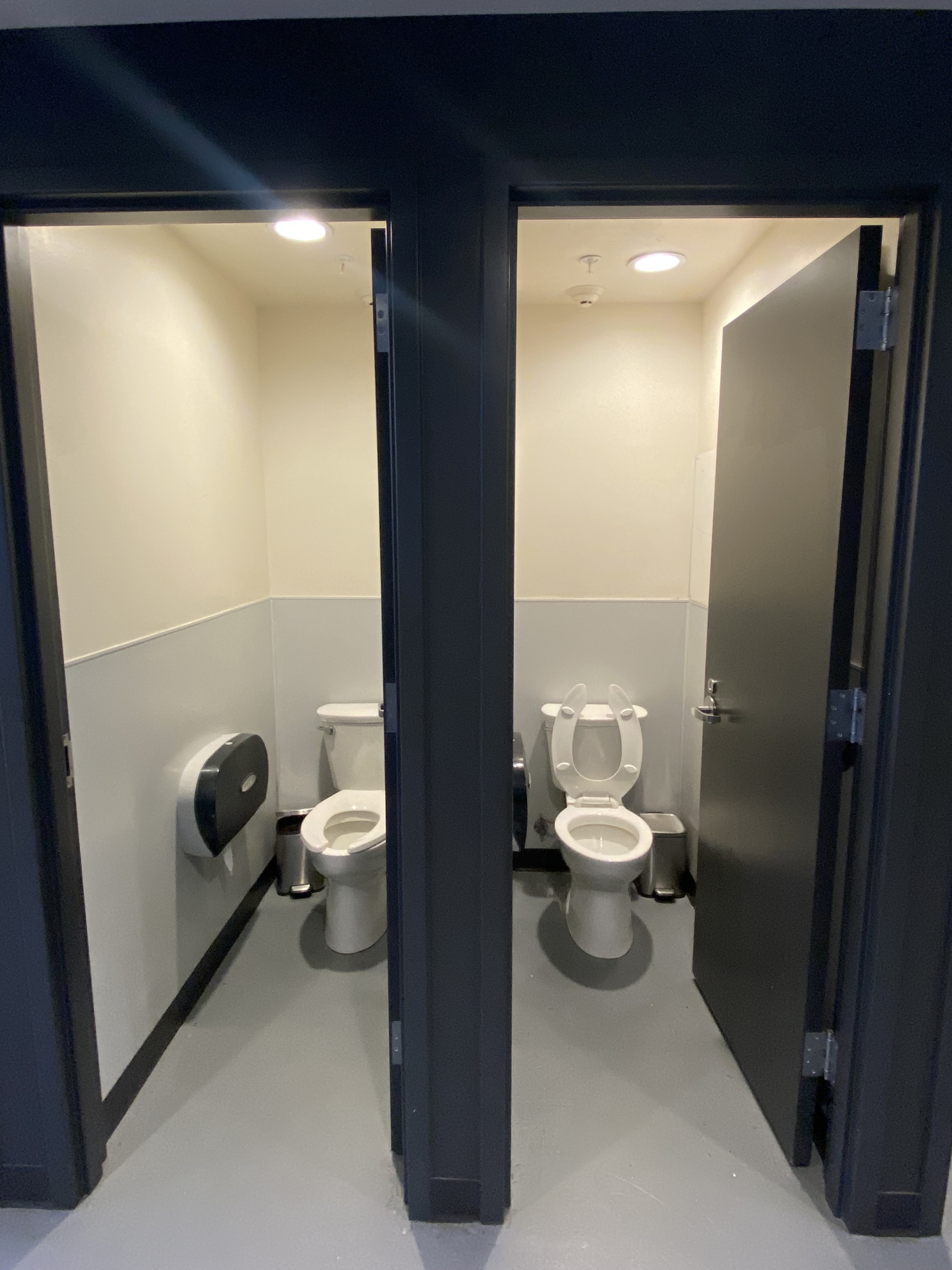
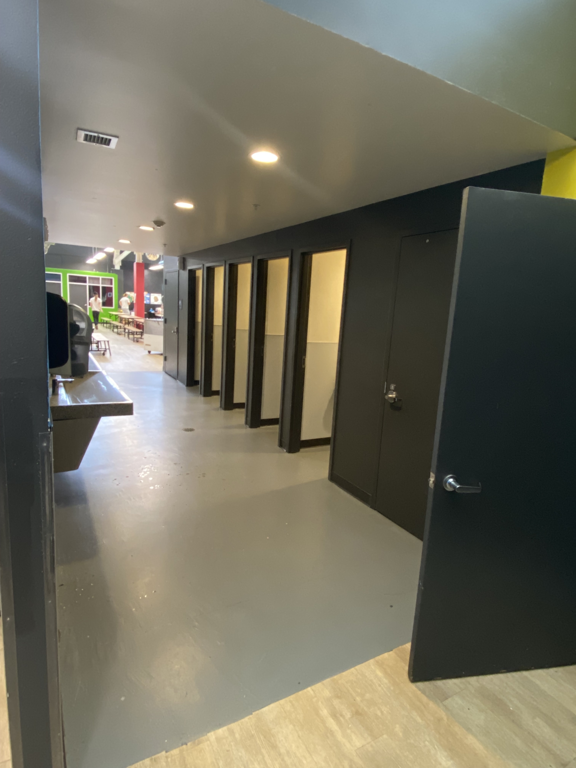
Shortly after our presentation, I was in a middle school and saw an inclusive restroom in action. I personally used a restroom to get a sense of how it felt and what I noticed about the experience. It was very private and felt secure, the door hardware had occupancy indicators (uncommon in multi-user restrooms) so it was very clear which stalls were or weren’t available for use. The extra wide clear space in between the restroom stalls and the wash area felt spacious and I could see how people of any variety of physical abilities, or those who are acting as caregivers for others, would benefit from the extra “elbow room” to move in and out of the space.
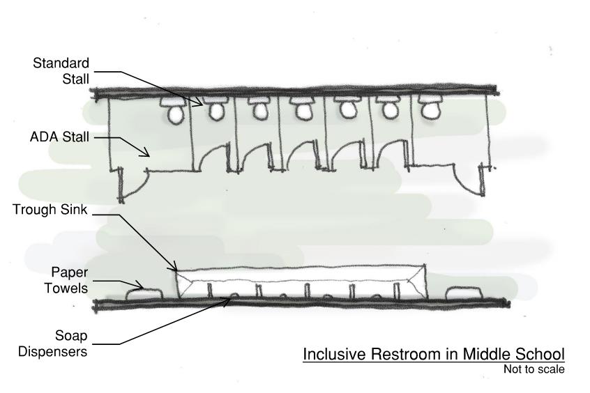
Before leaving the site, I asked one of the administrators about the restroom and what the students and teachers thought of the layout. They had glowing reviews about how much the school community enjoys this set up. Issues of bullying, “hiding out” from class, and any other “inappropriate behavior” had all decreased; the function of the space took precedence and they commented that everyone seems to feel comfortable in using the space. As identified in the HCMA Designing for Inclusivity document, the school found that these restrooms were:
- Inclusive for people with disabilities
- Inclusive for families
- Inclusive for transgender and non-binary people
- Increased privacy and safety
- Increased efficiency
- Forward-thinking design
We are inspired by this approach and will be looking for opportunities to design inclusive, all-user restrooms to remove barriers and support the progress of the normalization of this solution for all. We encourage you to consider it as well!
Additional Reading:
- Why Architects Must Rethink Restroom Designs in Schools
- Inclusive Restroom Design Guide
- Designing for Inclusivity


